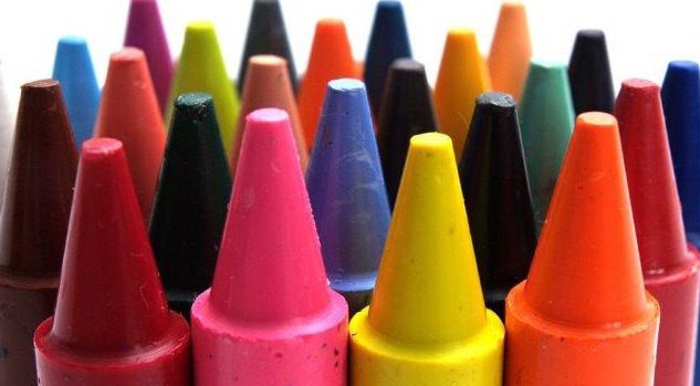
Used to be that when it came to choosing the Color of the Year, color giant Pantone was the only game in town. But times, they are a changing. Major paint manufacturers are weighing in with their favorite hues for 2019. Take a look. Variety is indeed the spice of life.
- For Pennsylvania-based PPG Paints, their choice is “Night Watch,” a “rich, luxurious, and classic shade of green that emulates the feeling of lush greenery,” connotes the healing power of nature, and works well “in a variety of design segments – from healthcare to commercial and residential design.”
- Benjamin Moore: Metropolitan AF-690 – “Calm, composed and effortlessly sophisticated, Benjamin Moore’s Color of the Year 2019, Metropolitan AF-690, exudes glamour, beauty and balance. This stylish gray ‘emanates nuance, harmony and extravagant ease. Always adaptable, it softens to matte or shimmers with sheen. It’s neutral. It’s understated. It just is. This is color, off-duty.’”
- HGTV Home by Sherwin-Williams: Reflecting Pool HGSW2324 – This aqua hue is fun, elegant, and most of all versatile. Balanced, optimistic, and “when combined with natural colors, it is soft and calm. Pair it with vivid colors, and it is energizing and bold!”
- Behr: Blueprint S470-5 – “An honest, approachable color that conjures up the blueprints builders rely on to bring architectural designs to life, Blueprint creates a space where you can build your own reimagined life—where awareness of what we want to build for ourselves can transform into action.”
- Valspar: Orange Slice 2002-1B – “Looking for an energizing color that commands attention? It doesn’t get any juicier than Orange Slice! Intense and adventurous, it was designed for color-curious consumers who want to shake things up at home in an easy, fun, and accessible way.”
- Sherwin-Willams: Cavern Clay SW7701 – “A warm terracotta color with ancient, elemental roots, Cavern Clay is a nod to midcentury modern style, but with the soul of the American Southwest. This warm, earthy hue is both casual and refined, and an easy way to bring the warmth of the outdoors in. Envision beaches, canyons and deserts, and sun-washed late summer afternoons—all of this embodied in one color.”
- PANTONE 16-1546 Living Coral – “Representing the fusion of modern life, PANTONE Living Coral is a nurturing color that appears in our natural surroundings and at the same time, displays a lively presence within social media. An animating and life-affirming coral hue, Living Coral embraces us with warmth and nourishment; welcomes and encourages lighthearted activity; and embodies our desire for playful expression.”


